Challenge
The client wanted to convert an existing kiosk check-in system to a more flexible mobile app, enabling patients to set appointments directly with their doctor.
Design
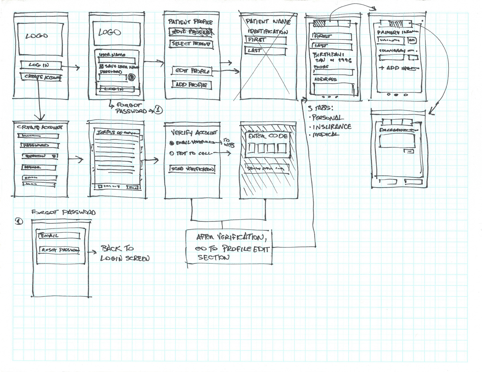
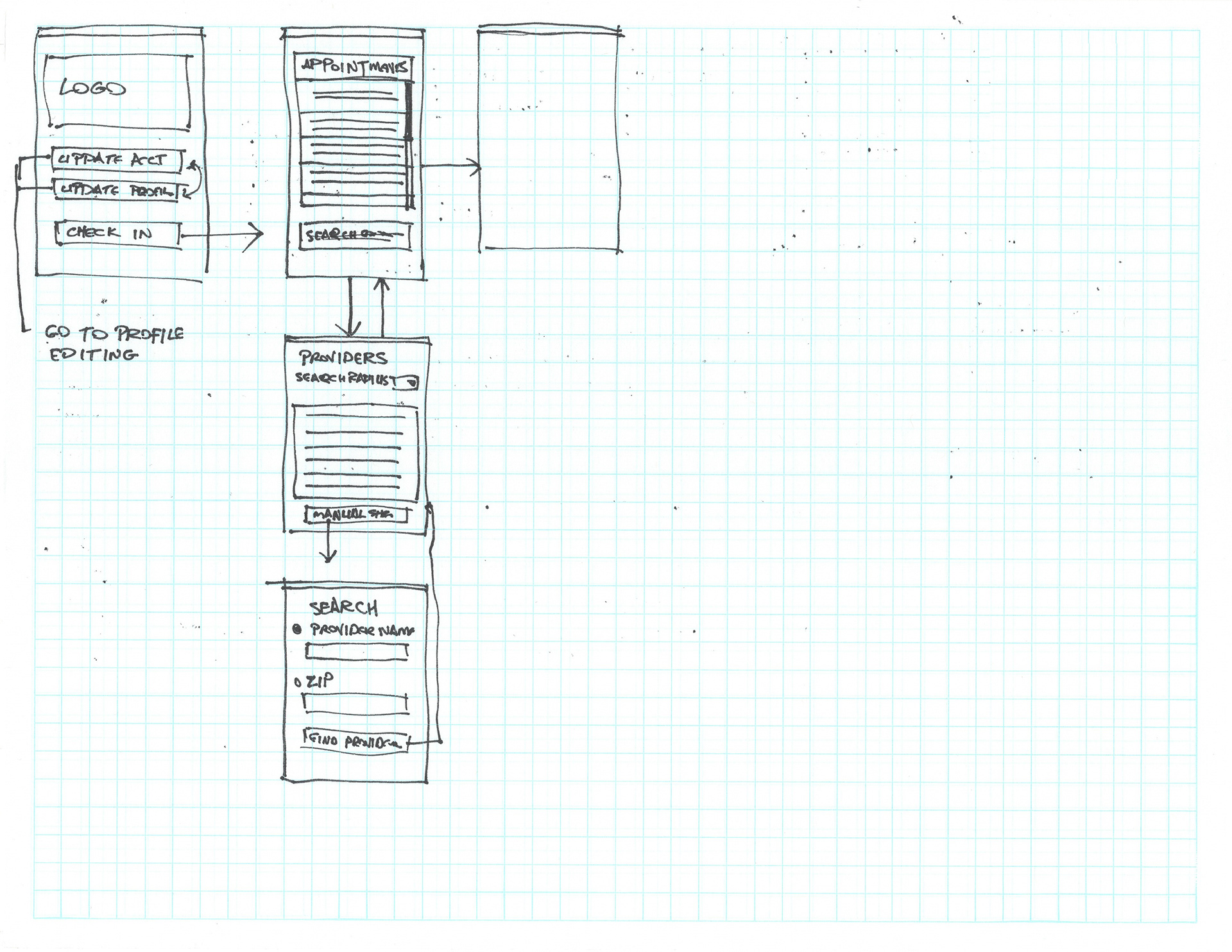
The client decided to ignore the development of user stories, since the project was based on an existing kiosk, and there was only one targeted user. I created a series of thumbnails showing a user flow through the app.


Wireframes
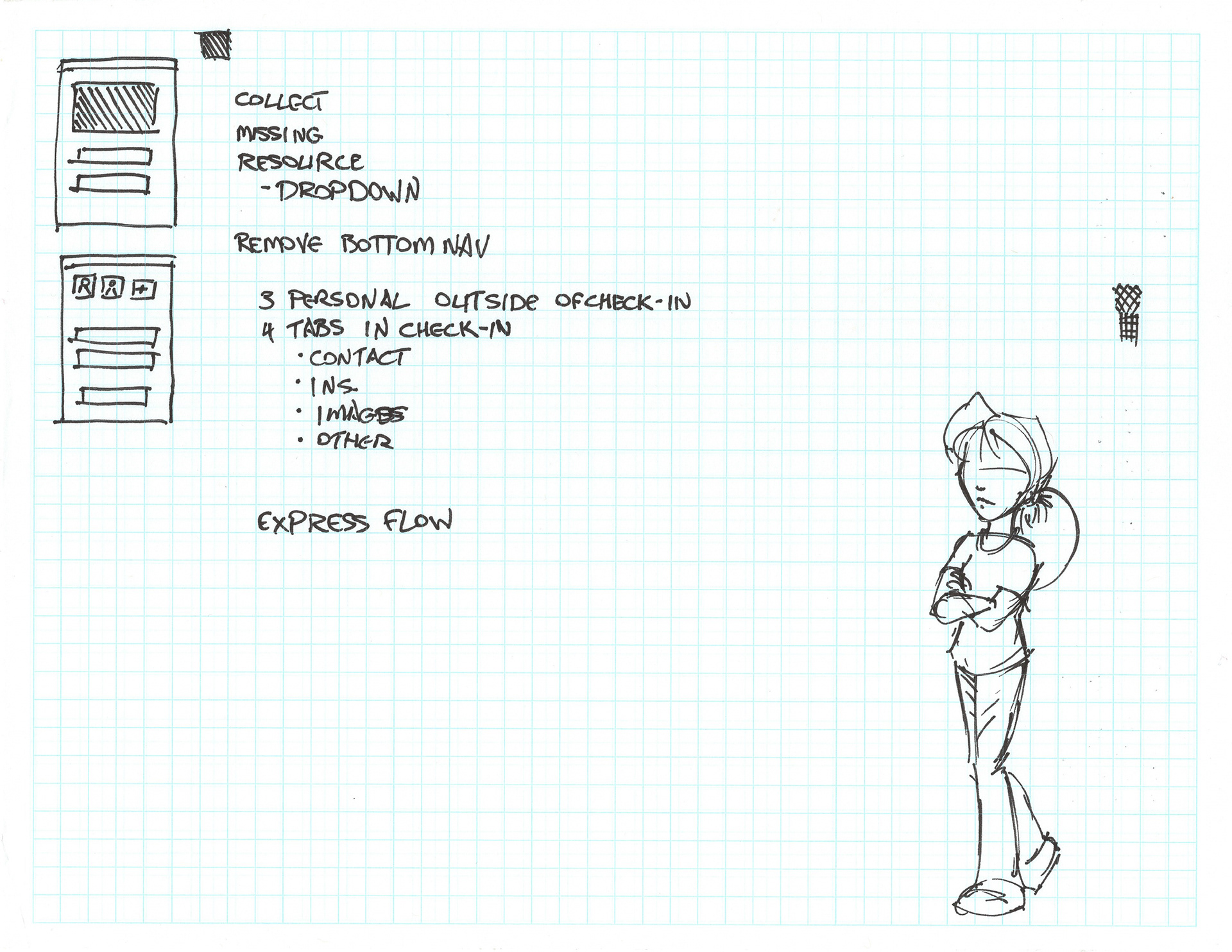
After mapping out the user flow through the app, I started to work on the wireframes. I was in constant contact with the client during the development; they had a better idea of the user flow through the app. We would meet daily to discuss new screens and possible improvements to the user flow and overall app.
Interaction
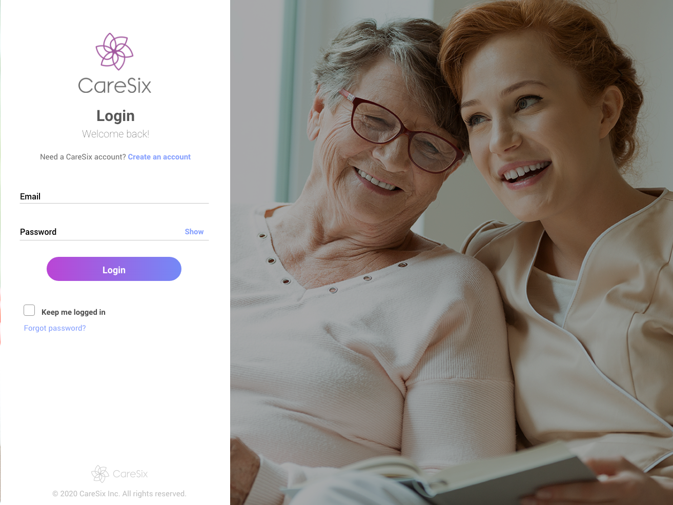
Since the client had engaged my services for a six-week period, I consolidated the wireframe design with developing interaction. There was no consideration for desktop or tablet design; the only target platform was mobile.
You can view the interactive demo here.
